M365 Password Update Experience SUX
June 30, 2025Tags: ux, sux
Oh look… another Sadukie on User eXperience (SUX) post, and big surprise it’s about Microsoft. 😩
Today, I’m fighting an arthritis flare-up. Since I’m in a world of hurt, I pay closer attention to processes and how much they hurt when I’m in pain. Today’s password adventures hit on all my pain points.
Password Update Pains
My phone notified me that I needed to update my credentials for one of my M365 accounts.
So that password reset that I had to do for Microsoft this morning on my phone… not a great experience.
First, there was the authenticator notice. I’m actually fine with that - no grumbles there.
Then, they need the current password. That’s a lot of characters to type. I’m on my phone and really need to check this account, so I have to go through this process.
Then, I have to hope I typed it correctly. There’s no Password Reveal Button for me to double check that.
This is a Password Reveal Button:
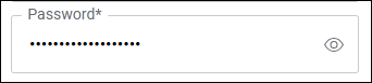
Now, I need to make sure that I come up with a new password and type it correctly twice. Again, no Password Reveal Buttons.
There’s a lot of hoping and praying as I go through this process. Because if I have a typo and have to type it all out again, there will be more frustration and more thinking of whether I really want to keep my accounts there.
It looks like it went through on mobile - here come the emails. So let’s update the password manager with the new password. Ok so far…
Why a Password Reveal Button Matters
A Password Reveal Button goes a long way. These are some of the benefits:
- Reduced input errors: Users can reduce the chance of submitting the typos.
- Improved accessibility: This helps those with visual impairments or cognitive challenges to confirm that typing.
- Enhances mobile usability: On small screens, a reveal button helps the user see typos and only correct the typo rather than having to retype the whole thing.
- Supports memory recall: This can reassure users that they did type their passwords correctly.
- Builds trust with the user: When the user can trust that their inputs are good, they tend to trust the site a little more.
- Perceived security control: When you pair this feature with a timeout or auto-hide option, it makes for better usability and security.
Oh But Wait… It Gets Worse
So I typed the password into the password manager and went to check the email on my desktop client. But somehow, the password I thought I typed in is not the password that it needs.
Fine, I’ll password reset this. 🔥
Listen, I know the purpose of CAPTCHAs. I know that accessibilty is hard. But I am not awake enough to deal with this “drunken letter” CAPTCHA:
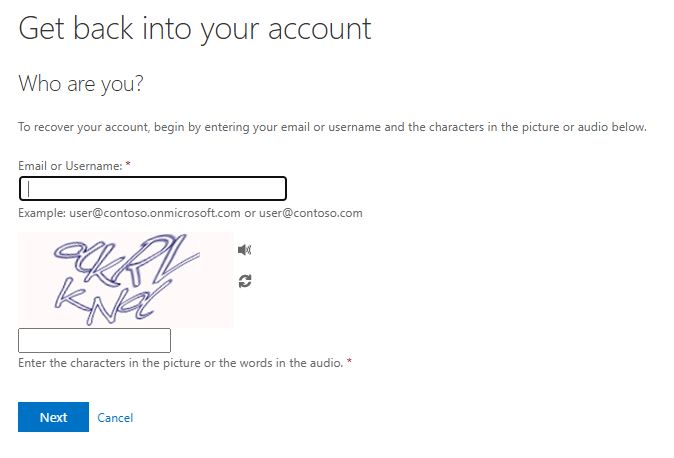
Why the Drunken Letters CAPTCHA Sucks
I call these the “Drunken Letters” CAPTCHAs because I think this is what it would look like if text got drunk. What font is that?!
These are some of the many issues with this captcha:
- Poor accessibility: Users with dyslexia, cognitive impairments, or low vision may have issues deciphering the warped text. It’s also possible for some cognitive impairments to come with auditory processing issues - so the audio part does not “save them”.
- High error rate: Due to the distortion of the letters, it’s easy for users to guess the CAPTCHA incorrectly multiple times.
- Cognitive load issues: Users have to switch gears from their task (logging in, reseetting the password, signing up, etc.) to solve a visual puzzle. This interrupts flow and increases abandonment.
Alternative CAPTCHAs
There are plenty of other CAPTCHAs out there.
Distorted Text CAPTCHA
- Pros:
- Simple to implement
- Widely used and familiar
- Cons:
- Difficult for users with visual impairments, dyslexia, or cognitive challenges
- High error rate, especially on mobile
- Notes:
- Often fails accessibility standards
- Frustrating user experience on small screens
Image Selection CAPTCHA
- Pros:
- More intuitive for sighted users
- Harder for bots to solve
- Cons:
- Inaccessible to screen readers
- Challenging for users with motor impairments
- Notes:
- Can be culturally biased or confusing
- Not mobile-friendly
Audio CAPTCHA
- Pros:
- Provides an alternative for visually impaired users
- Cons:
- Often hard to understand due to background noise or accents
- Not suitable for users with hearing impairments
- Notes:
- Should be offered alongside other accessible options
Logic/Math CAPTCHA
- Pros:
- Simple and accessible to most users
- Cons:
- May be bypassed by bots
- Not ideal for users with cognitive disabilities
- Notes:
- Best suited for low-risk or low-security scenarios
Invisible CAPTCHA (e.g., reCAPTCHA v3)
- Pros:
- No user interaction required
- Seamless and user-friendly
- Cons:
- Opaque to users (they may not know it’s there)
- Relies on behavioral tracking, which may raise privacy concerns
- Notes:
- Highly accessible when implemented correctly
Conclusion
When you have a good password update experience, you’re probably not hearing the praises of how awesome it is. We need to be able to sing the praises of people who get it right. However, at the same time, when there are painful experiences, you can count on me to point out where they are and how we might be able to make it better. The password update experience in M365 has a lot of pain points. Maybe one day, I’ll be able to write that it’s a great experience. But, today is not that day.